Covid-19 and the Irish Routine

The way in which the terrible virus that is Covid-19 has rampaged through the entire world over the course of 2020 has altered the behaviour of humanity in a way no one could have foreseen. With the aim of understanding the properties of this disease alongside the way in which it is (and ultimately will) spread through and affect society has resulted in a momentous collaborative effort across all areas of science from epidemiologists all the way through to economists. The community of applied mathematicians and statisticians have been conducting research at the forefront of this effort through developing compartmental models not unlike those seen in an introductory dynamical systems course and making use of a variety of datasets in order to both increase the complexity of the models and also infer the parameters needed to fit said models with the empirical incidence rate.
The requirement for datasets to aid this scientific endeavour and inform society itself has resulted in large companies making some of their (usually vaulted!) data – generated through the digital traces left every day when interacting with technology – publicly available. Arguably the most obvious demonstration of this is the mobility data provided by two of the world’s largest corporations – Apple and Google. Both of whom are currently providing aggregated data from requests made to their corresponding map services over multiple geographical resolutions ranging from country, to county, to in some cases city levels. This offers the potential to gain an insight into just how much the daily Irish routine has been altered in the age of social distancing and travel restrictions. To demonstrate some of these insights two data sources in the case of Ireland are considered below.
Apple
Apple have released daily country level time series data on how levels for three modes of transport – driving, walking, and public transport – changed relative to the baseline values from January 13th. One may see in the early points of the time series in Figure 1 that Irish society had a relatively consistent weekly pattern of all three modes of transport with two consecutive peaks (the weekends) followed by five more modest values describing the weekdays. The first reported case of the virus on Irish shores occurred on the 29th February but we see that it is almost two full weeks before a significant change in the transport levels occur when the Containment Phase strategy was introduced with the closure of schools and colleges on March 12th.

The readily increasing number of cases resulted in the announcement of national travel restrictions on March 27th and on this date arguably the most interesting point in the entire time series is seen with a significant increase suggesting a possible `last chance saloon’ to travel home before restrictions came into place. One may then observe over the following two months how the country was brought to a near standstill in terms of mobility. Also, interestingly, it can be seen that Apple had missing data from the 10th and 11th of May showing how even the largest corporations can run into problems with data collection! Restrictions began to ease through the end of May as the number of cases had slowed and a roadmap of Phases were proposed with specific relaxations at each point. After Phase 1 (18th May), which involved increasing the permitted travel distance to 5km from one’s home, an increase in mobility across all modes occurs and further gains after the commencement of Phase 2 which further extended the travel distance to 20km. The levels of mobility is gradually returning to those seen prior to the start of Covid-19 as the growth in the number of cases decreases.
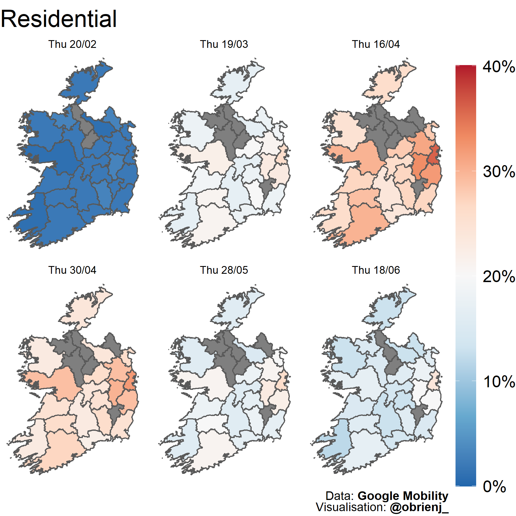
Similar to Apple, Google has also released aggregated time series of requests to their own map service but with a different set of descriptions. Rather than the mode of transport used above, Google released requests regarding six distinct categories – retail and recreation, grocery and pharmacy, parks, transit stations, workplaces, and residential areas. They also provided a finer level of resolution namely at a county level. Here two of the categories (residential and workplaces) at six different Thursdays over the past few months are considered.

The set of plots in Figure 2 shows the percentage change in the frequency at which people were at a workplace from a baseline taken over January 3rd – February 6th. A considerable decrease as the restrictions were at their strongest up to the end of April is seen. In the final two maps however a return to normality is observed as the restrictions have lifted demonstrating people returning to work. One interesting aspect throughout is the level of workplace activity in Dublin. The capital city is found in the small county in the east of the island which is the darkest shade in each of the six plots, the suggestion being that workers have been slower to return to work in Dublin, with the hypothesis being that the more technical jobs found there are more amenable to ‘working-from-home’ and this development will prove interesting to follow as the country further moves out of restrictions.
The equivalent statistics in the case of residential areas are shown in Figure 3, where the grey areas represent counties in which there wasn’t enough data to provide a statistically significant estimate. These show the opposite effect to that found in the workplace requests as to be expected with people having to stay at home if they cannot go to the workplace. But again, the gradual return to the original baseline can be seen as we move forward in time and restrictions ease suggesting a return to some form of normality for the Irish population.
Summary
The availability of previously sensitive data offers fantastic opportunities for the applied mathematics community to provide analysis to society on the effect Covid-19 has had while also offering the potential to be included in technical models being used to describe the spreading process and how it is changing as these restriction measures fluctuate. It is also fascinating to get a small insight into the data which is available to these large corporations as a result of the use of their services and how they may be learnt from. Positively, it appears from these two separate sources that Irish daily life is slowly returning to where it was prior to the commencement of restrictions as the speed at which the virus spreads has been slowed with such great effect which one hopes to remain the case as society progresses in the future.
This article originally appeared on the ECMI (European Consortium for Mathematics in Industry), the article can be found here.
Joey O'Brien
Senior Quantitative Analyst
Senior Consultant in quantitative finance and data science for Acadia, working in R and Python.